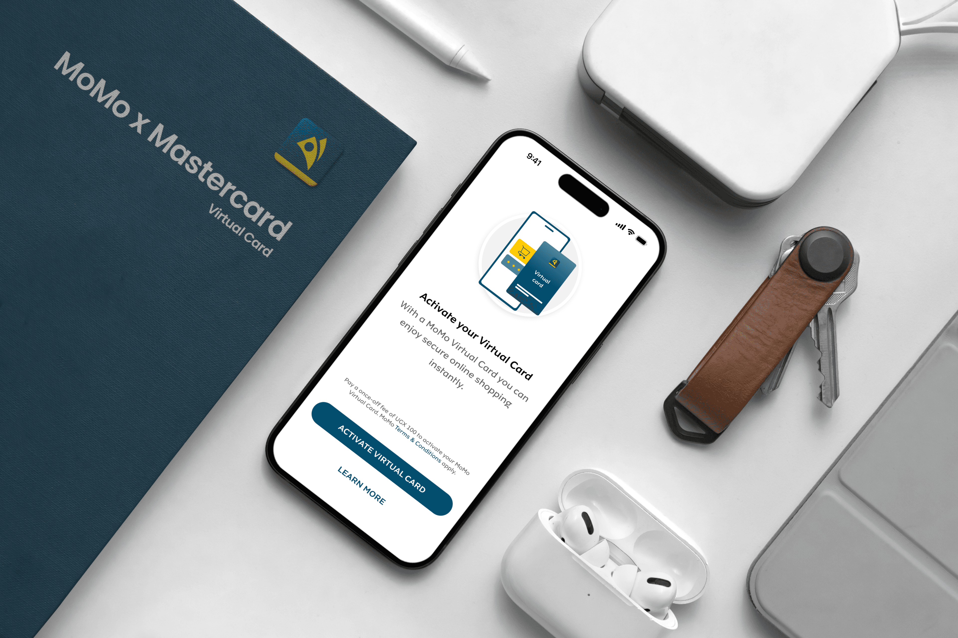
MoMo × Mastercard
Virtual card implementation for Africa's largest mobile money network.
Senior Product Designer · MTN Mobile Money
- Role
- End to end product design. Journeys, flows, UI.
- Scale
- 69.5M monthly active users across African markets.
- Challenge
- Turn 100M+ mobile money users into digital shoppers despite 85% lacking traditional banking.
- Outcome
- 1M virtual cards projected in Year 1.
The challenge
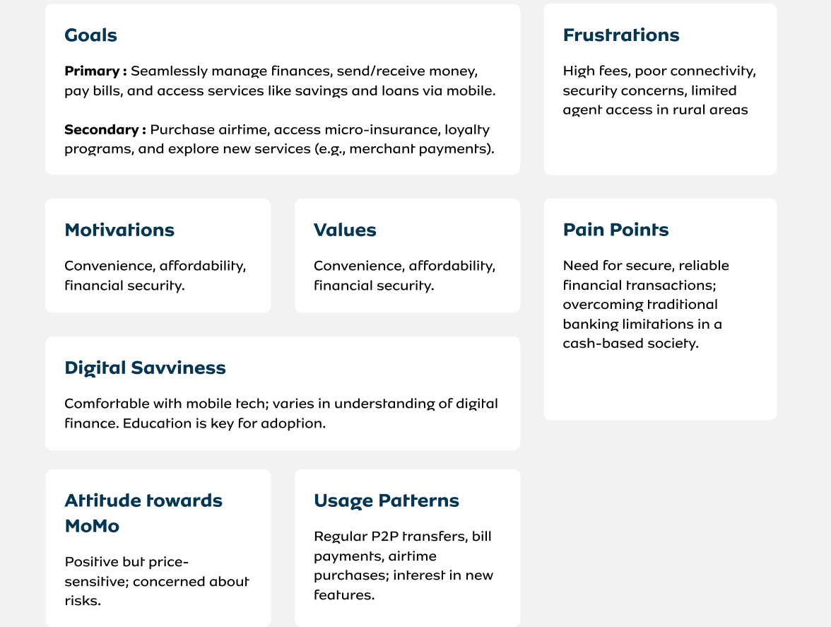
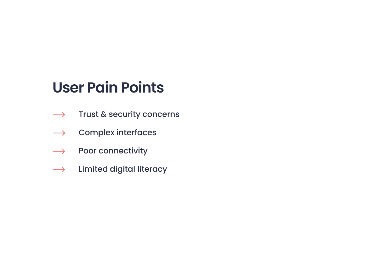
In the markets MoMo serves, mobile money is the financial system, not an add-on to it. But its users were locked out of digital commerce. Most had no bank account, transactions were declined at high rates, and the products built for cards weren't built for them.
Strategy
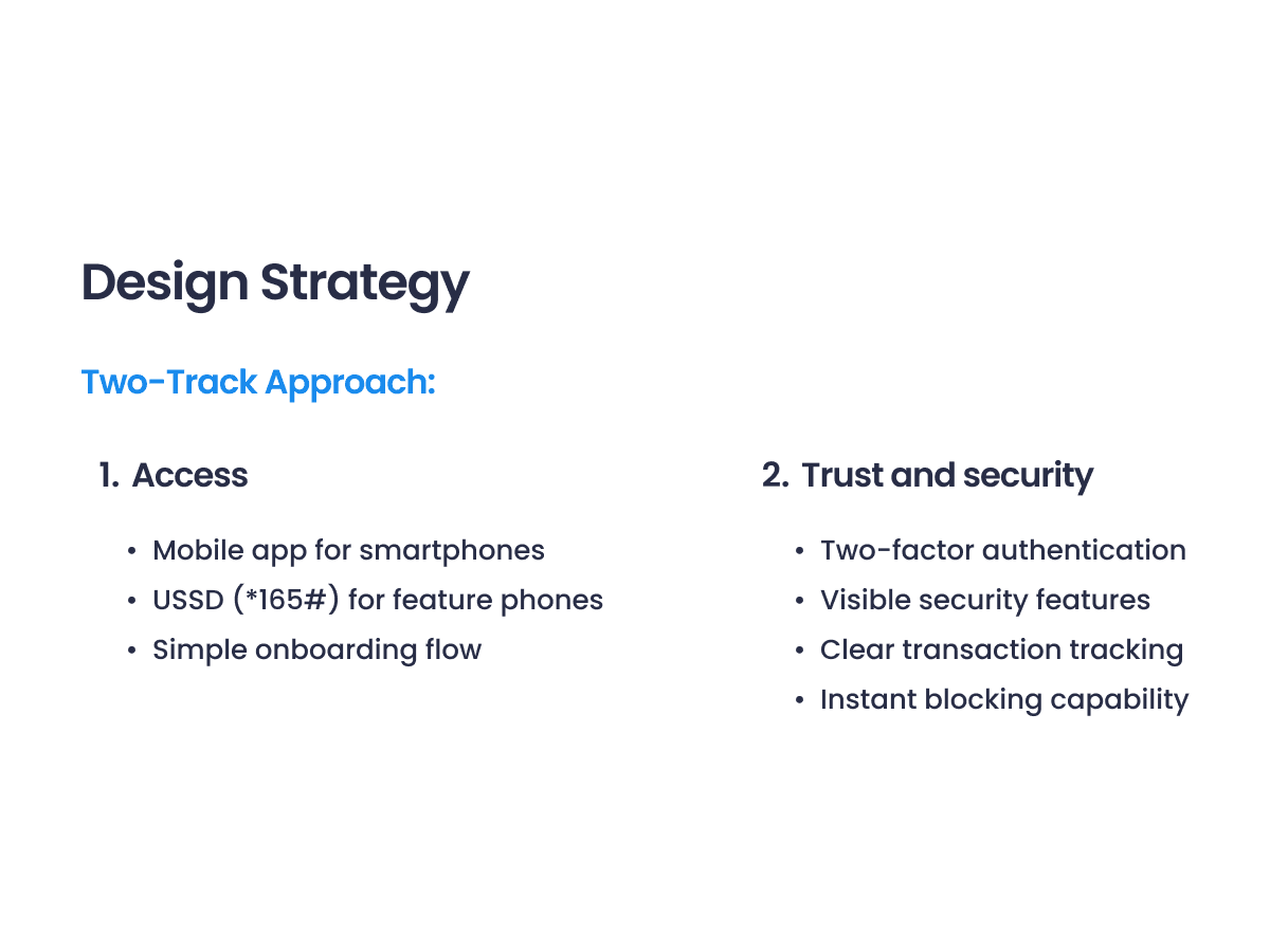
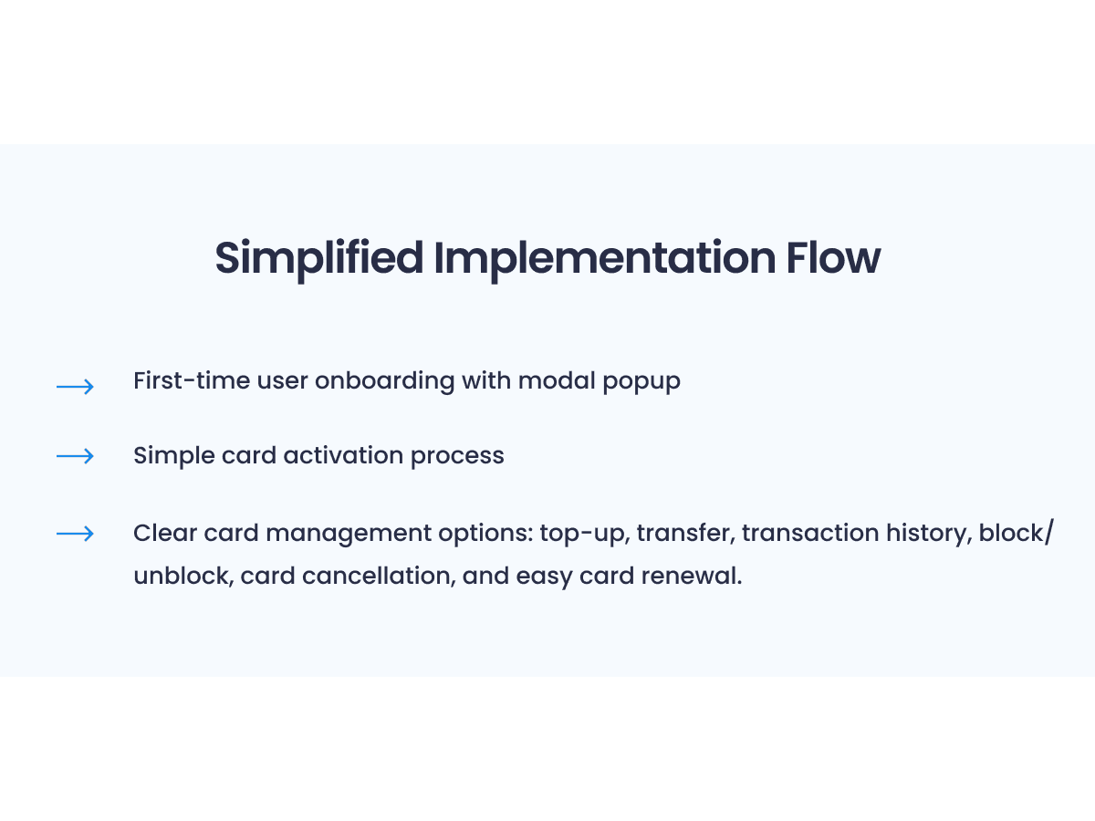
Two tracks, deliberately balanced. Access, so the product worked on smartphones and feature phones with onboarding simple enough for first time digital shoppers. And trust, with two factor authentication, visible security cues, transaction tracking and instant blocking, so users could move money without thinking twice.
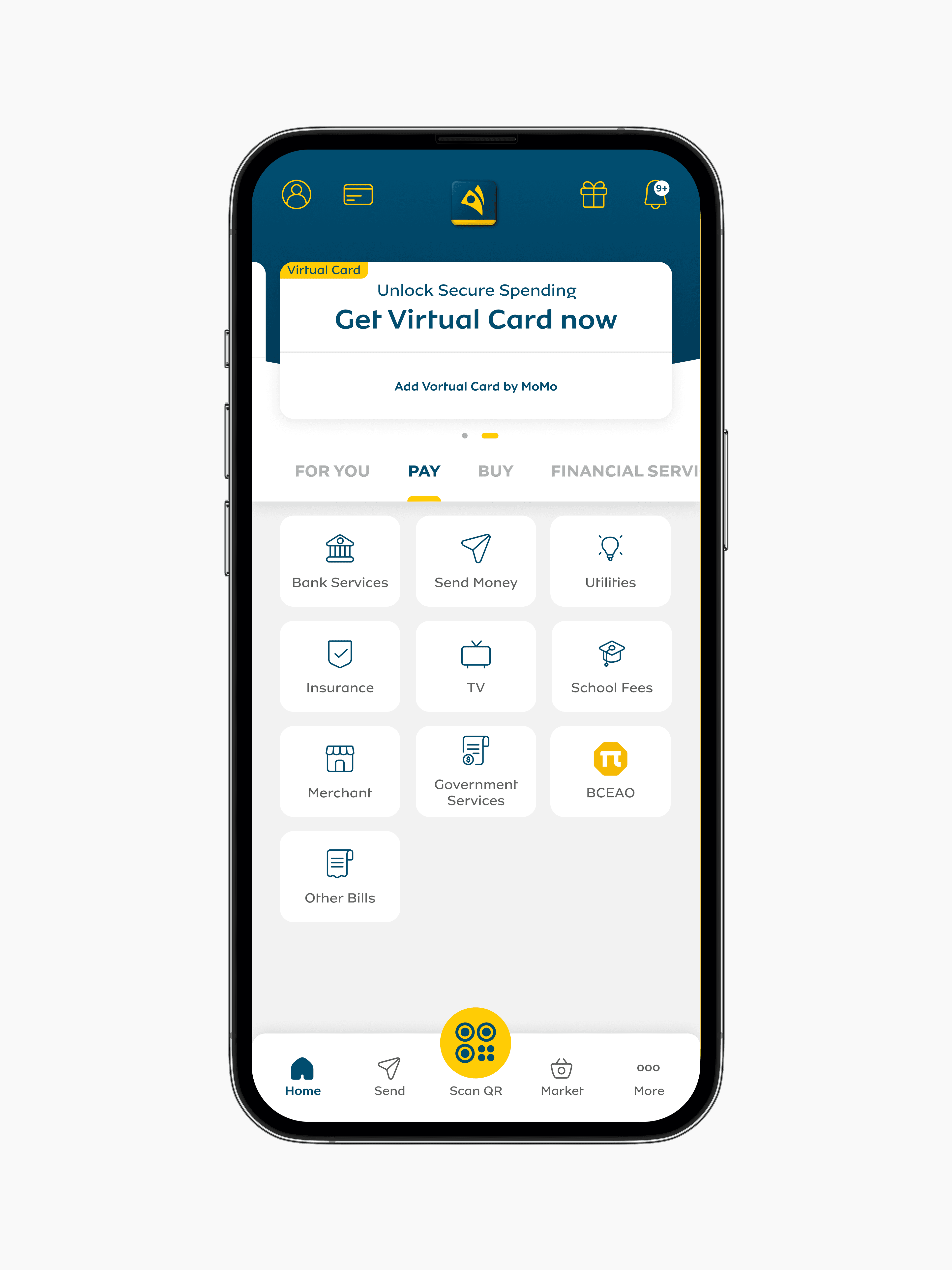
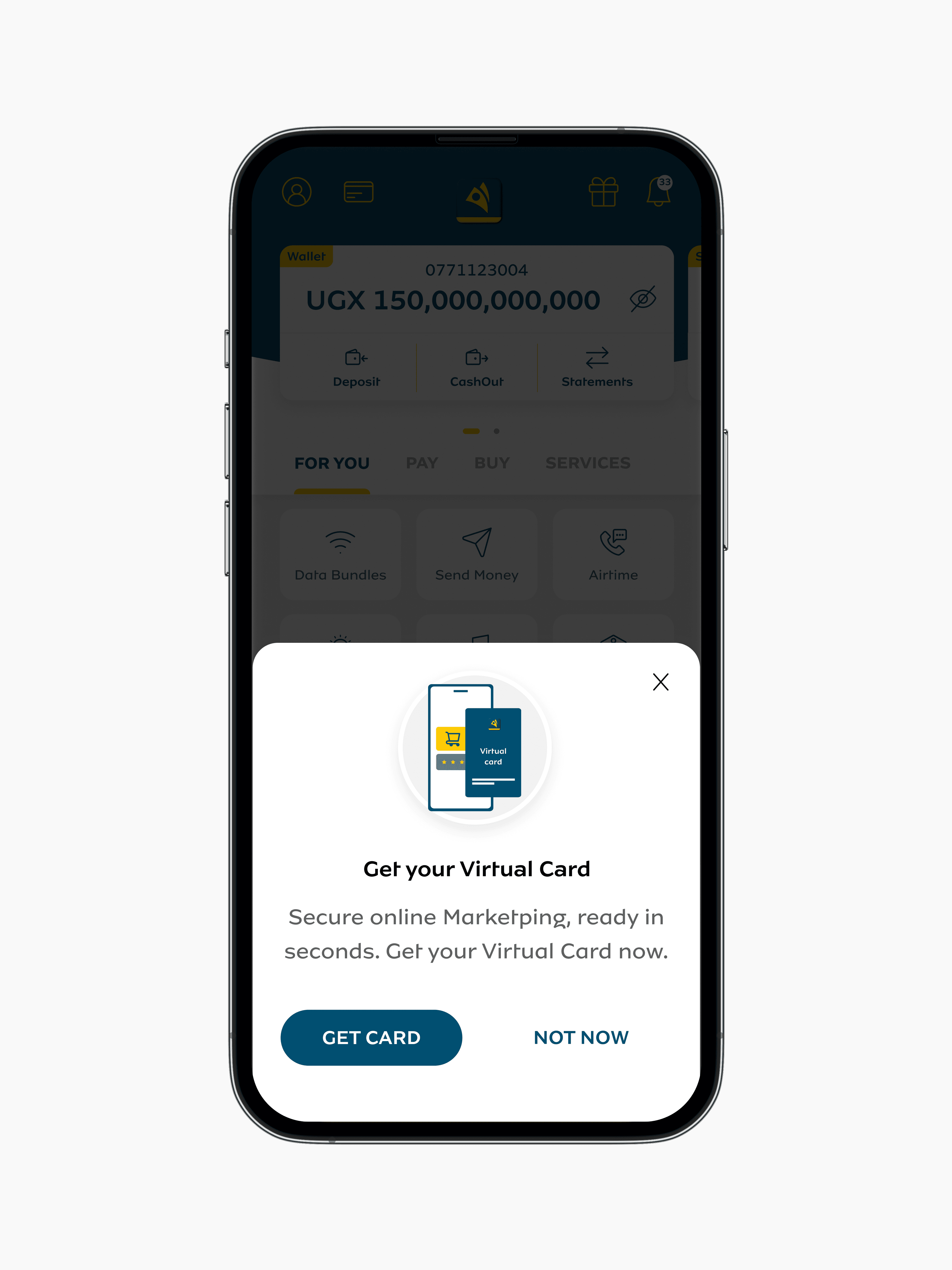
Onboarding designed around a first time digital shopper, with a behavioural nudge to build confidence.
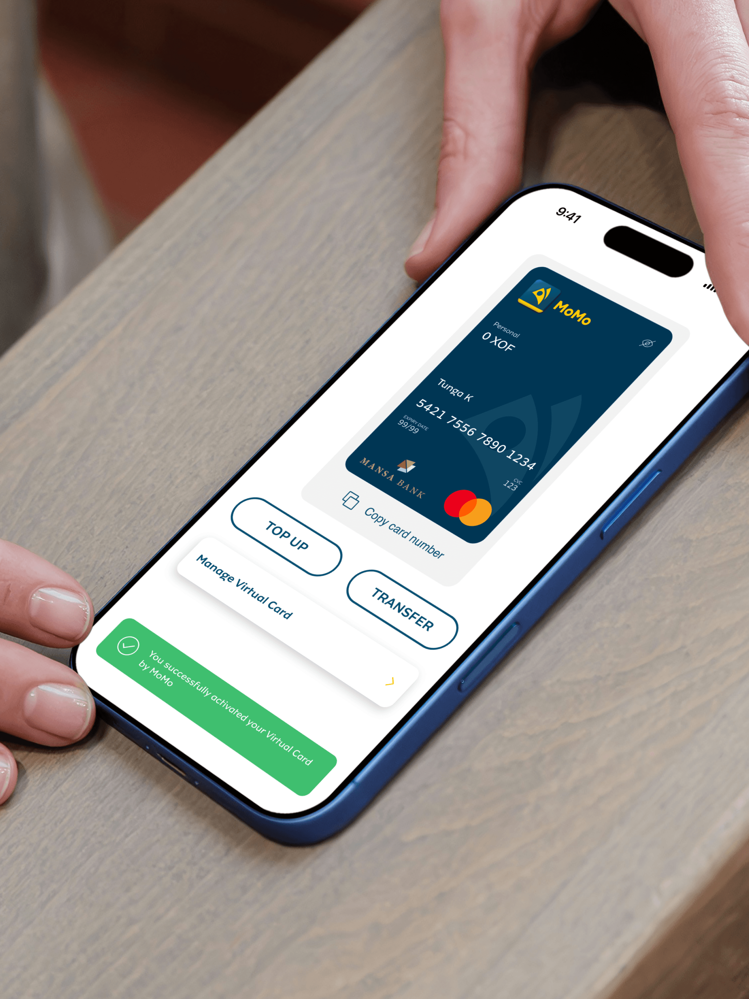
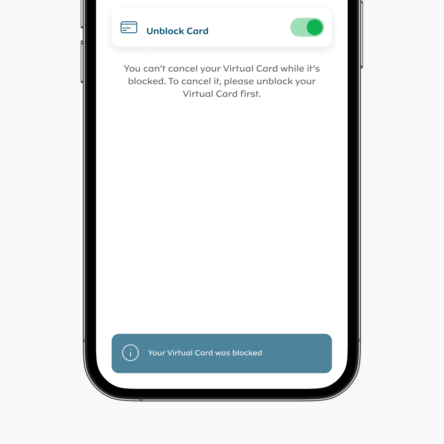
Card management as the trust surface
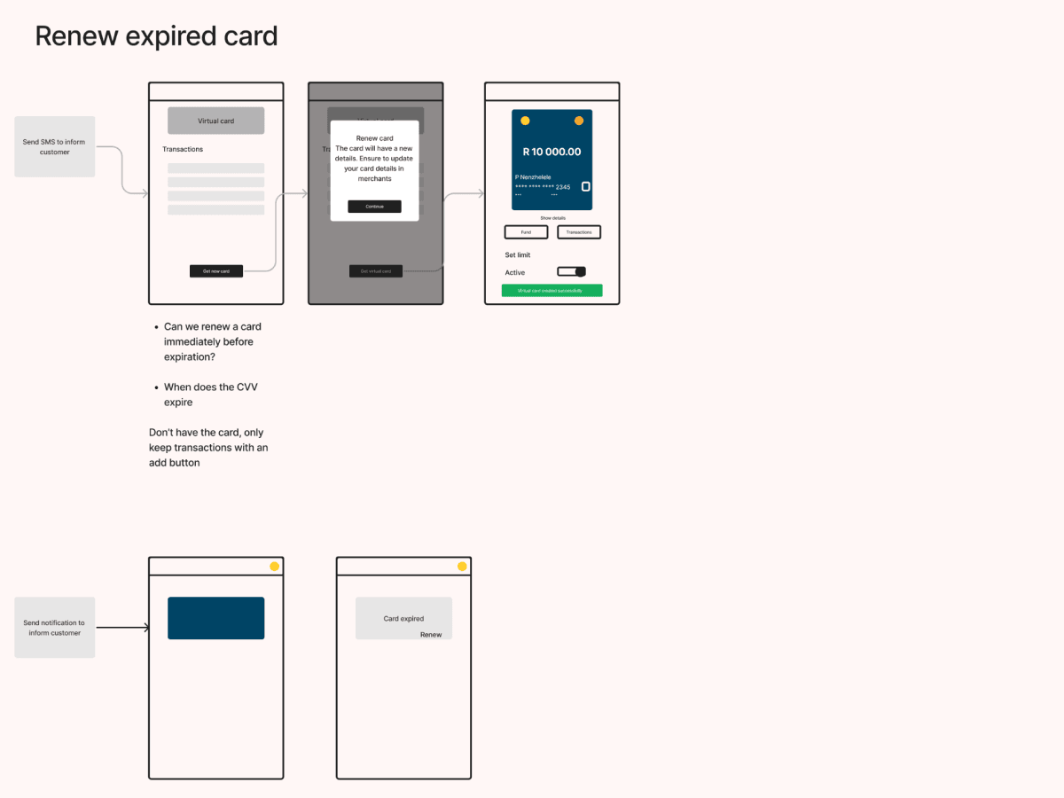
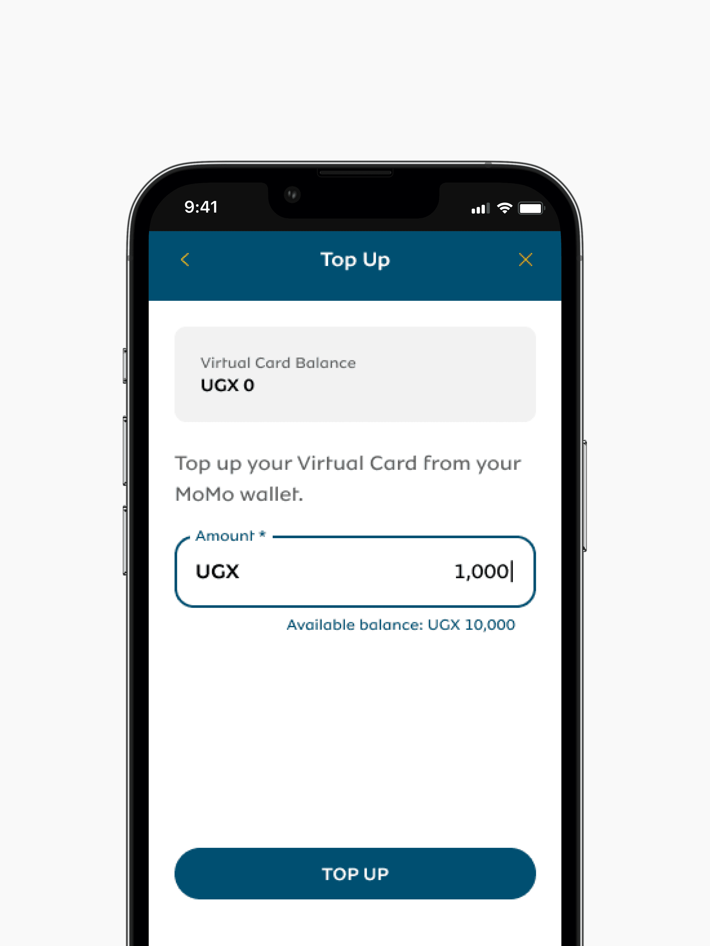
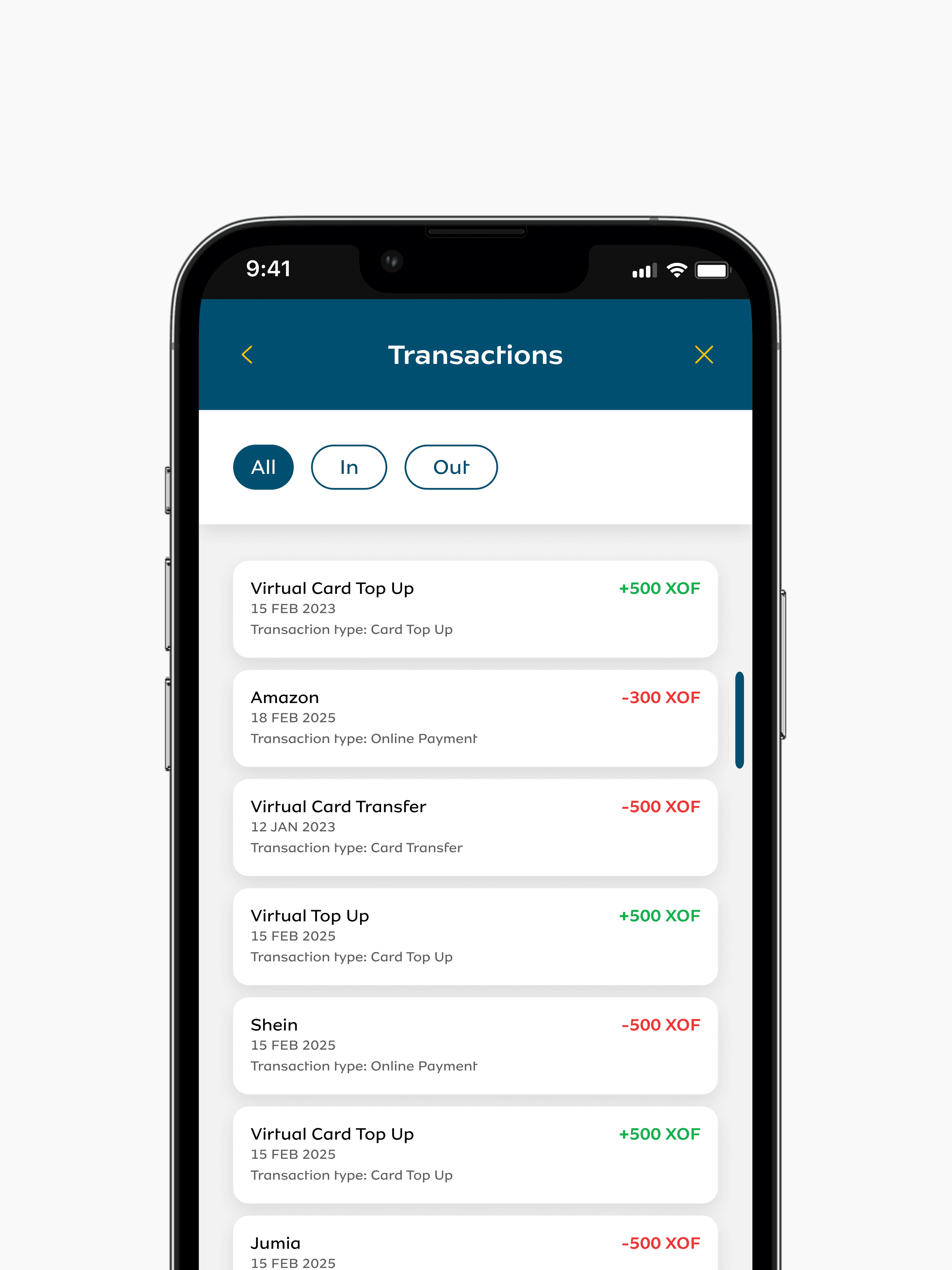
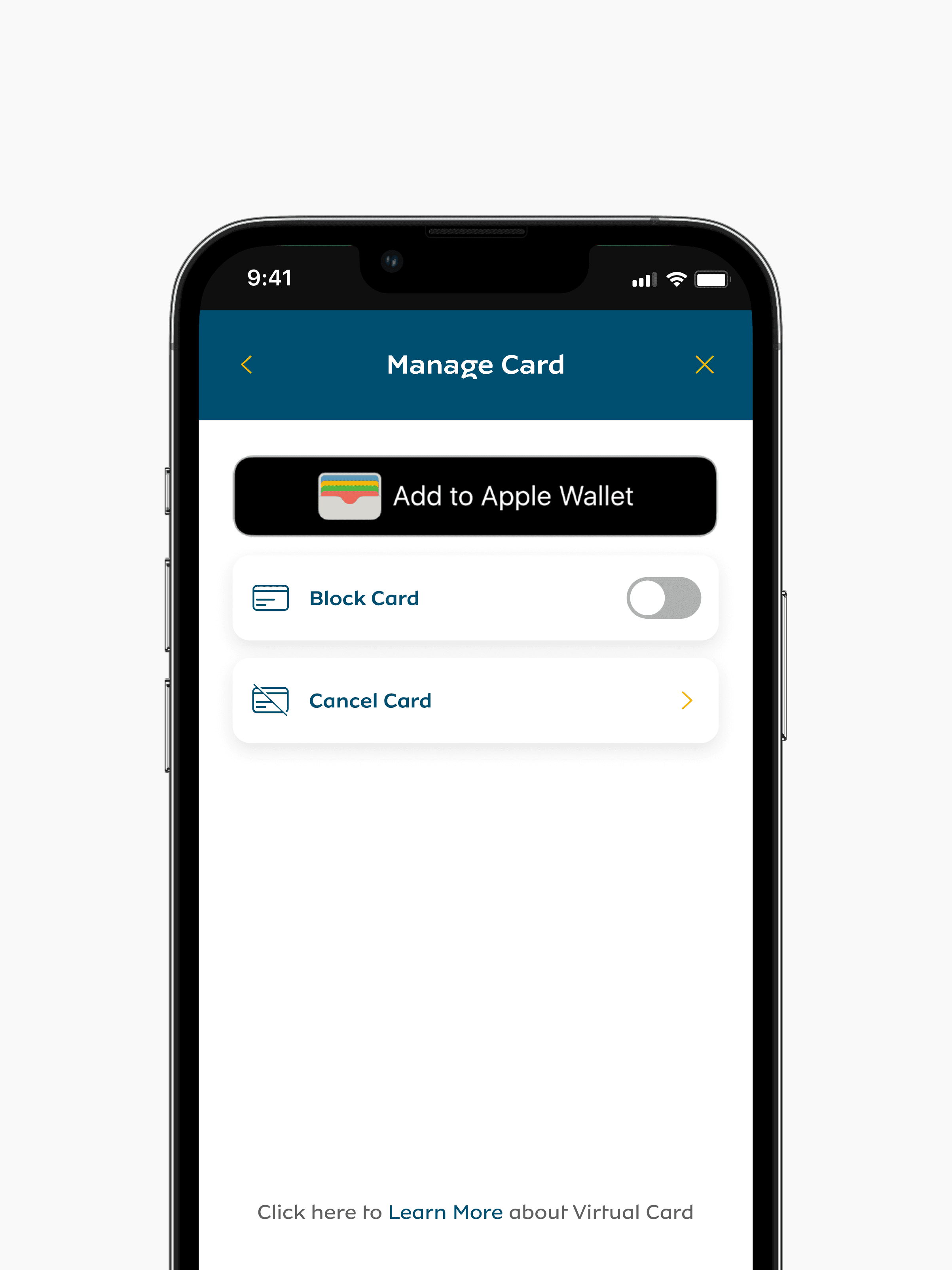
Security only works when people can see it. Card management became the place where users felt in control. Clear states for top up, transaction history, blocking and unblocking, and quick card cancellation, designed so the user always knew what their money was doing.
What I learned
Security has to be visible without being intimidating. Onboarding has to assume nothing. And in markets where the wallet is the bank, every UI decision is a decision about who gets included in the digital economy and who doesn't.
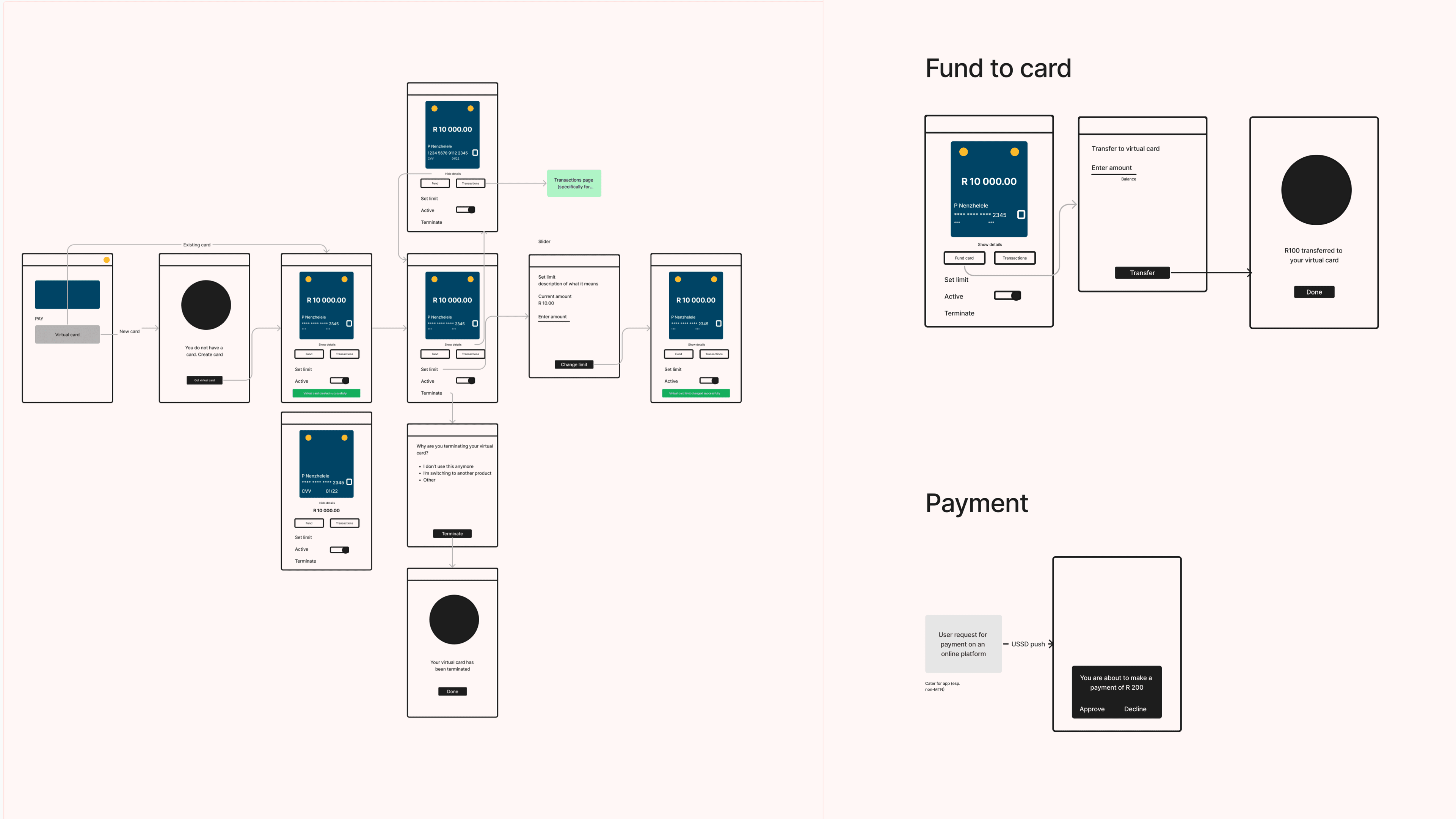
Process artefacts